|
Website Design
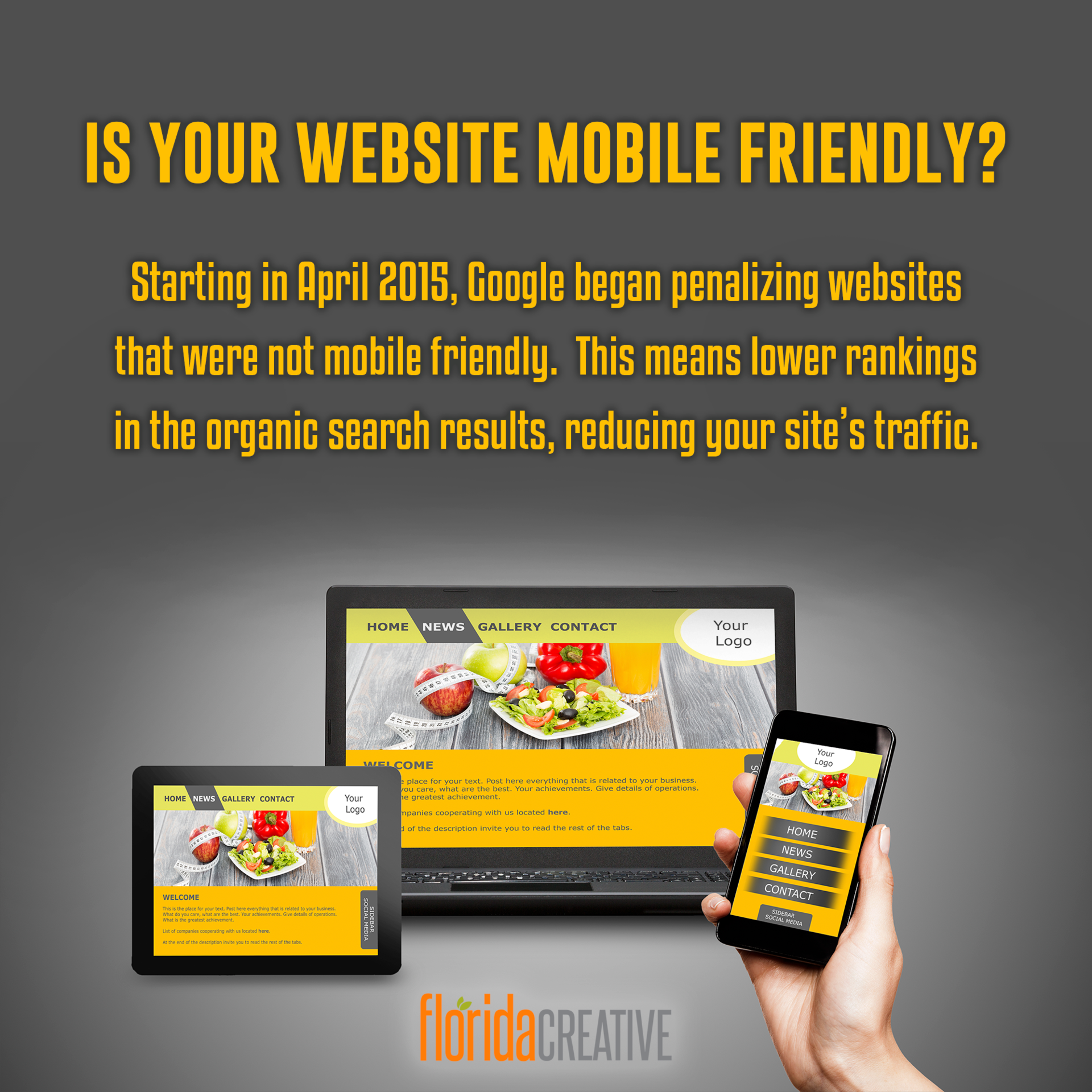
Starting in 2015, Google started ranking websites higher that were "mobile friendly" ahead of those that were not able to display properly on phones and tablets. In the 2000s, newer design technologies had allowed sites to have different versions for different devices. This was called "Adaptive Web Design." This meant that the website developer would have to upload 3 different versions (or more) to allow the right size to be displayed, based on the browser window size. What happens when a website is not responsive? The easy answer is that the UX/UI (User Experience & User Interface) just isn't very easy to view on a mobile device. Click here for an example of a website that is neither Adaptive nor Responsive. If you take a look on your desktop or laptop computer, it's just a very plain, unattractive design. However, if you try to view it on a smartphone, you really see why this type of old school design is not great for vie ...
READ MORE

FREE SEO AUDIT
FOR YOUR WEBSITE
Enter your email to get a FREE 75‑POINT SEO AUDIT
for your existing website.
No obligations required.
for your existing website.
No obligations required.
ENTER YOUR EMAIL ADDRESS:
NO THANKS
TYPE THIS NUMBER:
NO THANKS