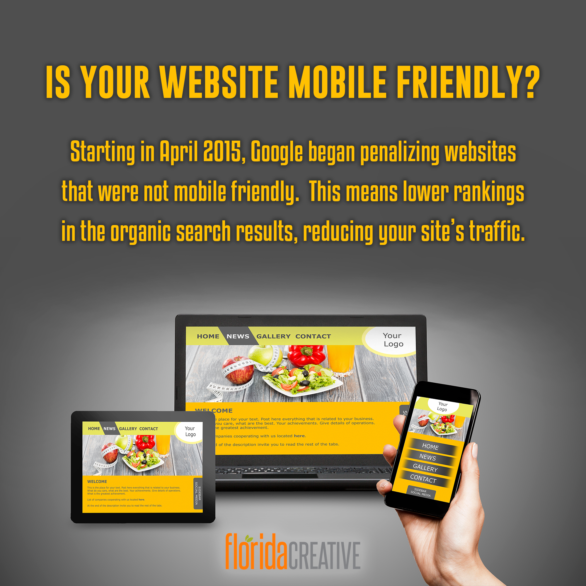
Starting in 2015, Google started ranking websites higher that were "mobile friendly" ahead of those that were not able to display properly on phones and tablets. In the 2000s, newer design technologies had allowed sites to have different versions for different devices. This was called "Adaptive Web Design." This meant that the website developer would have to upload 3 different versions (or more) to allow the right size to be displayed, based on the browser window size. What happens when a website is not responsive? The easy answer is that the UX/UI (User Experience & User Interface) just isn't very easy to view on a mobile device. Click here for an example of a website that is neither Adaptive nor Responsive. If you take a look on your desktop or laptop computer, it's just a very plain, unattractive design. However, if you try to view it on a smartphone, you really see why this type of old school design is not great for viewing on your phone. The main goal of responsive design is to avoid unnecessary resizing, scrolling, zooming, or panning that happens with sites that have not been designed using the current responsive design standards. It is typically very difficult to navigate these sites, and you run the risk of your site's visitors hitting their back button to find a competitor's website. Responsive website design also replaces the previous need to design a dedicated mobile website for smartphone users, which was called Adaptive design. Now, instead of designing multiple websites for different screen sizes, you can have a single website that scales up or down automatically to match the device on which it’s being viewed. Contact us today to get a free quote on your new Responsive Website design. |


FREE SEO AUDIT
FOR YOUR WEBSITE
for your existing website.
No obligations required.
NO THANKS

